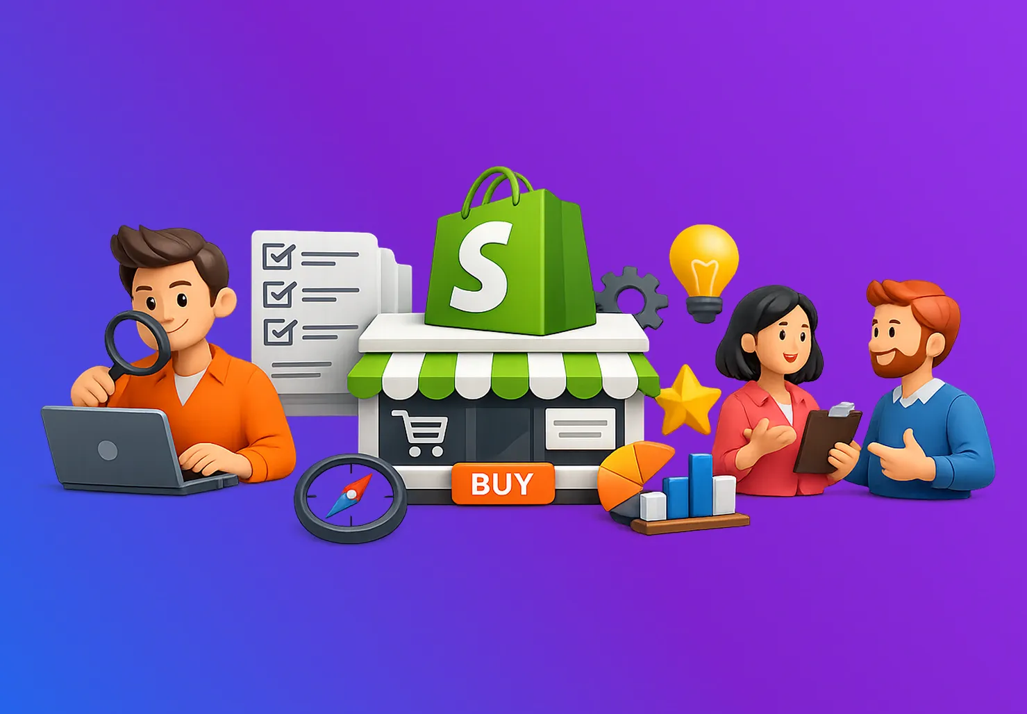


Here’s something we’ve learned launching dozens of successful single-product Shopify theme stores: when you’re selling one thing, every pixel either helps or hurts.
There’s nowhere to hide weak messaging, no catalog to browse when your value proposition doesn’t land immediately, no other products to distract from poor photography.
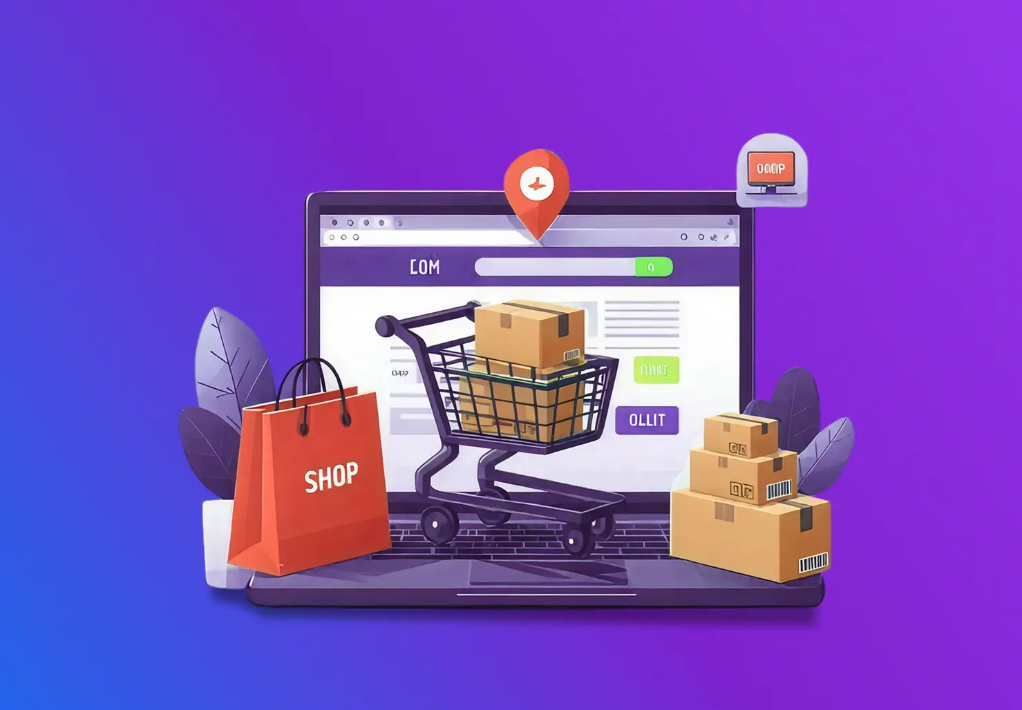
That single product Shopify theme you choose becomes your entire customer experience, and it better convert like crazy.
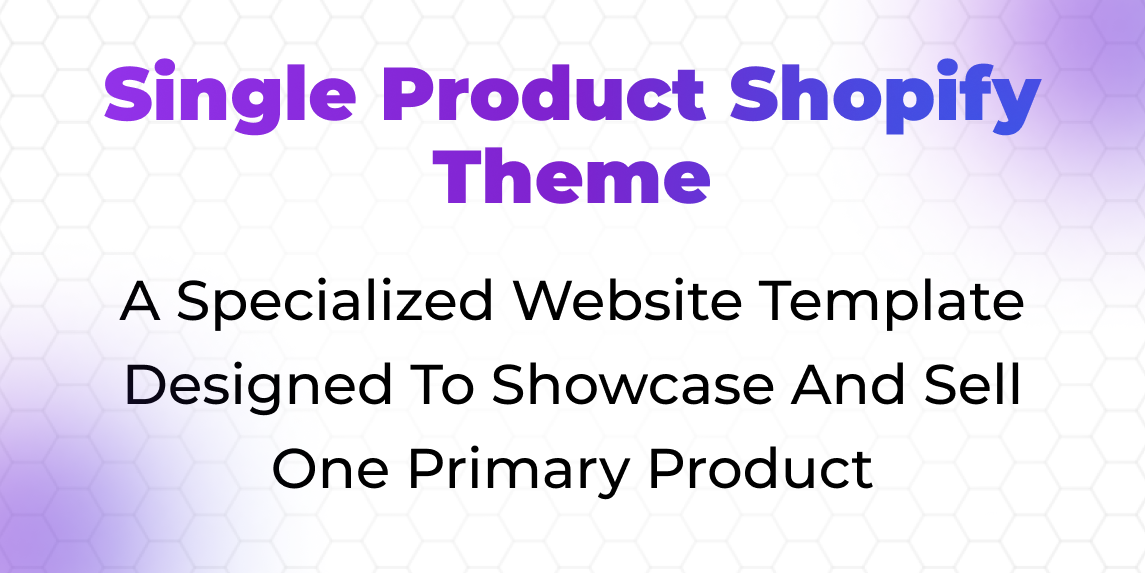
What Is a Single Product Shopify Theme?
A single-product Shopify theme is essentially a high-converting landing page built into Shopify’s ecommerce framework, designed specifically for businesses selling one core product with perhaps a few variants or complementary add-ons.
Think of it as direct response marketing meeting ecommerce functionality, all the persuasion techniques of conversion-focused landing pages combined with seamless purchasing capability.
These themes strip away typical e-commerce architecture that creates unnecessary complexity when you’re only selling one thing. No extensive navigation menus.
No collection pages organizing products by category. No search functionality, hunting through catalogs. Instead, you get laser-focused layouts that tell one compelling story from the hero section through features, benefits, social proof, objection handling, and ultimately to a conversion point visitors can’t miss.
What makes a one-product Shopify theme genuinely different from just using a regular theme and hiding everything except one product?
Purpose-built conversion optimization.
The Shopify single product store theme approach understands landing page psychology, how to structure information progressively so visitors get exactly what they need at each decision stage.
Where to place trust signals for maximum impact, how to handle objections at precisely the moment they arise in the visitor’s mind, and how to create urgency that motivates action without feeling manipulative or desperate.
The best implementations also recognize that selling one product often means explaining it thoroughly.
These themes provide extensive room for detailed descriptions, multiple image angles showing products from every perspective, video integration that demonstrates usage, specification tables comparing variants, and comprehensive.
FAQ sections that pre-answer every possible question, all organized so visitors naturally flow through information rather than feeling overwhelmed by walls of text.
Top 15 Single Product Shopify Themes
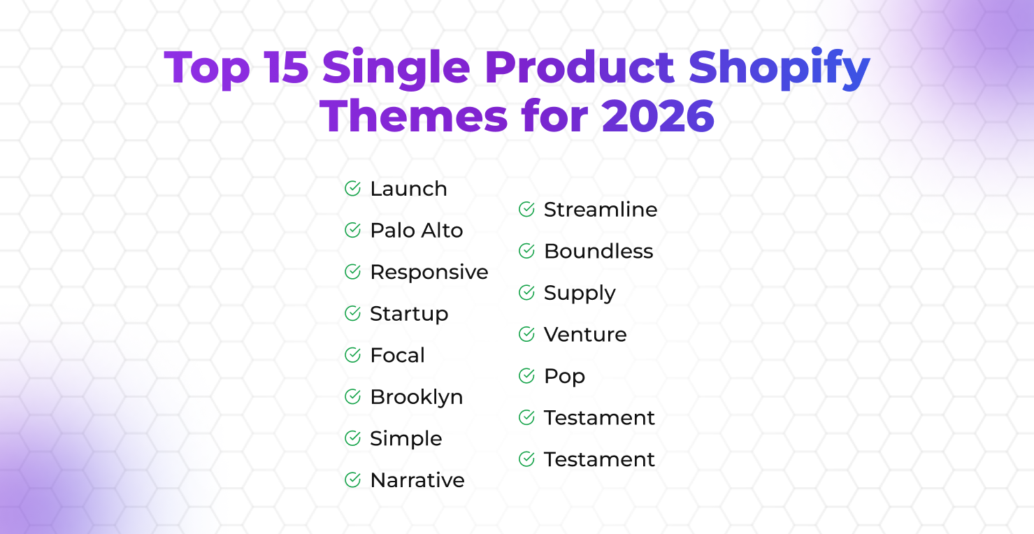
1. Launch
Launch lives up to its name as the ultimate Shopify theme for product launch scenarios. The theme’s structure mirrors successful Kickstarter campaigns and product launch pages, guiding visitors through a narrative arc that builds excitement and anticipation.
We’ve used Launch for nutrition products where the story behind formulation and ingredient sourcing mattered as much as the product itself.
The theme’s countdown timer functionality creates genuine urgency for limited releases, while its email capture integration builds pre-launch lists effectively.
What makes Launch particularly valuable is how it handles variant selection, keeping focus on the core product while allowing size, color, or bundle variations without fragmenting attention.
2. Palo Alto
Palo Alto brings a sophisticated, editorial approach perfect for premium single products where brand story drives purchase decisions.
The theme’s typography-focused design and generous whitespace create the feeling of browsing a luxury magazine rather than shopping a typical e-commerce store.
Fashion accessories, artisan goods, and high-design products benefit from Palo Alto’s refined aesthetic that suggests exclusivity and craftsmanship.
The theme includes sophisticated product image galleries that let photography tell stories visually, reducing reliance on text while maintaining conversion effectiveness through strategic placement of trust signals and calls-to-action.
3. Responsive
Don’t let the generic name fool you, Responsive is a powerhouse Shopify one-product website template that prioritizes mobile experience above everything else.
Given that mobile traffic dominates most product categories, this focus matters enormously. The theme’s mobile-first design ensures every element renders perfectly on phones, with large tap targets, streamlined forms, and checkout flows optimized for one-handed phone operation.
We’ve seen conversion rate differences of 40-50% between desktop and mobile on poorly optimized themes, but Responsive maintains consistent performance across devices.
4. Startup
Startup targets exactly what its name suggests, new brands launching their first product with limited budgets but serious conversion goals.
The theme provides essential functionality without overwhelming new merchants with complexity they don’t need yet.
Its straightforward setup means you can launch quickly, while its clean design prevents the “obviously using a budget theme” appearance that undermines premium positioning.
For founders testing product-market fit before investing heavily in custom Shopify development, Startup provides a professional foundation that converts adequately while you validate demand.
5. Focal
Focal understands that for many single products, visual storytelling drives conversion more than text ever could.
The theme’s image-first design philosophy puts photography and video at the absolute center of the experience, with minimal text overlay and generous space for visual content.
Lifestyle products, fashion items, and anything where seeing the product in context matters benefit from Focal’s approach.
The theme handles high-resolution images efficiently without destroying page speed, using lazy loading and optimization techniques that maintain visual quality while keeping load times acceptable.
6. Brooklyn
Brooklyn has evolved from a simple theme into a sophisticated minimal Shopify theme for single product stores that balances aesthetic minimalism with conversion functionality.
The theme’s clean lines and restrained design language work beautifully for modern, design-conscious brands that want their product to speak for itself without visual competition from busy layouts.
We’ve implemented Brooklyn for wellness products where the brand positioning emphasized purity and simplicity, the theme’s design reinforced those brand values while maintaining all necessary conversion elements.
7. Simple
Simple does exactly what it promises, strips away everything unnecessary to focus purely on product and purchase. This radical simplification works remarkably well for straightforward products where complicated explanations aren’t needed and the value proposition is immediately clear.
The theme’s no-nonsense approach reduces decision friction by eliminating every possible distraction between arrival and purchase.
For replenishment products, upgrades to existing solutions, or anything where customers arrive with purchase intent already established, Simple’s streamlined approach converts efficiently.
8. Narrative
Narrative excels at exactly what its name suggests, telling product stories that connect emotionally before asking for the sale.
The theme’s structure naturally guides visitors through origin stories, founder journeys, mission statements, and the “why” behind products before transitioning into features and purchasing.
Brands built around social missions, sustainability, or personal founder stories leverage Narrative’s storytelling structure to build an emotional connection that justifies premium pricing and creates customer loyalty beyond transactional relationships.
9. Streamline
Streamline prioritizes conversion efficiency above all else, implementing direct response marketing principles learned from high-performing landing pages.
The theme’s layout follows proven conversion patterns, bold headlines, benefit-focused copy, strategic social proof placement, and prominent calls-to-action that guide visitors toward purchase without confusion about next steps.
We’ve tested Streamline extensively for clients selling solutions to specific problems, where clear communication of benefits and friction-free purchasing matter more than aesthetic sophistication.
10. Boundless
Boundless breaks from typical single-product patterns by offering full-width, edge-to-edge designs that create immersive brand experiences.
The theme works exceptionally well for products with strong lifestyle associations or aspirational positioning, where you’re not just selling an item but an identity and belonging to a community.
Adventure gear, fitness products, and lifestyle brands benefit from Boundless’s immersive approach that makes visitors feel part of something larger than a simple transaction.
11. Supply
Supply targets practical product categories where specifications, comparisons, and detailed information drive purchasing decisions.
The theme includes robust tables for specifications, comparison charts for variants, and an organized information architecture that helps visitors find exactly what they need to make confident decisions.
Technical products, equipment, and anything where detailed specifications matter benefit from Supply’s information-dense but well-organized approach.
12. Venture
Venture brings outdoor, adventure-focused aesthetics perfect for products associated with exploration, nature, and active lifestyles.
The theme’s rugged design language and earthy color palette create atmospheres that align with products designed for outdoor use, travel, or adventure.
Camping gear, outdoor apparel, and adventure-focused products leverage Venture’s aesthetic to reinforce brand positioning while maintaining strong conversion functionality.
13. Pop
Pop creates playful, energetic experiences perfect for products targeting younger demographics or categories where fun and personality drive purchasing.
The theme’s bold colors, animated elements, and contemporary design language work well for products that shouldn’t take themselves too seriously.
Novelty items, gifts, youth-oriented products, and anything where personality differentiates from competitors benefit from Pop’s vibrant approach.
14. Testament
Testament brings gallery-quality presentation perfect for single products where visual appreciation drives value perception.
The theme’s museum-like aesthetic works beautifully for art, photography, handcrafted goods, or any product where the item itself deserves to be appreciated as craftsmanship rather than merely purchased as a commodity. The minimalist interface ensures nothing competes with the product for visual attention.
15. Express
Express prioritizes speed and conversion efficiency through technical optimization and streamlined user experience.
The theme loads remarkably fast, implements aggressive caching, and strips away any element that doesn’t directly contribute to conversion.
For competitive markets where page speed affects both Shopify SEO rankings and conversion rates, Express’s performance-first approach provides measurable advantages that translate directly into more sales from the same traffic.
Why Choose a Single Product Shopify Theme?
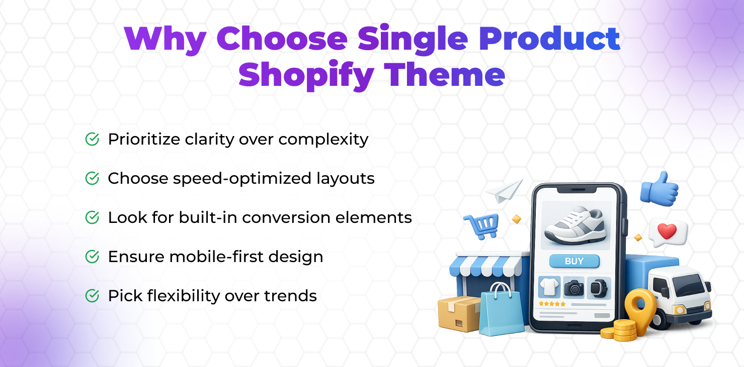
Eliminated Decision Fatigue
When you’re selling multiple products, visitors face constant choices about what to explore next, which category to browse, and whether they’ve seen everything relevant.
This decision-making creates mental fatigue that reduces conversion. A high-converting Shopify theme designed for single products removes all these choices, there’s one thing to consider, and every element of the page exists to help visitors evaluate that one decision effectively.
We’ve seen conversion rate improvements of 40-60% simply by removing the paradox of choice.
Focused Storytelling
Multi-product stores fragment attention across dozens or hundreds of products, making coherent brand storytelling nearly impossible.
Single product stores let you tell one complete, compelling story from start to finish. Every sentence, every image, every testimonial builds toward one conclusion, this product solves your problem.
This narrative focus creates emotional connection and perceived value that justifies pricing and overcomes objections more effectively than scattered messaging across multiple products ever could.
Simplified Technical Implementation
Managing inventory, variations, and logistics becomes exponentially simpler when you’re dealing with one product. No complex category structures.
No variant management across hundreds of SKUs. No inventory coordination across multiple suppliers.
This simplification reduces operational complexity, lowers costs, and eliminates many potential technical problems that plague multi-product stores.
Your theme doesn’t need sophisticated inventory management,it needs conversion optimization.
Optimized Marketing Efficiency
Marketing one product means every dollar spent drives visitors to the same conversion goal. Your ad creative, landing page experience, and product page are all the same thing.
This alignment creates marketing efficiency, impossible with multi-product stores where traffic fragments across different products with different conversion rates.
Optimization efforts compound, improvements to your single page benefit all traffic, not just visitors to one specific product.
Faster Testing and Iteration
With one conversion goal, testing becomes straightforward. Change a headline, modify an image, adjust social proof placement,every test clearly shows impact on the single metric that matters: conversion rate.
Multi-product stores require complex testing, accounting for traffic distribution across products, category dynamics, and interaction effects. Single-product stores let you iterate rapidly toward optimization without statistical complexity.
Stronger Brand Identity
Becoming known for one thing creates stronger brand recognition than trying to be everything to everyone. Single product brands develop clear identities, they’re “the [specific solution] company” rather than “the store that sells lots of stuff.”
This clear positioning makes marketing more effective, word-of-mouth more natural, and brand recall significantly stronger.
Key Features of High-Converting Single Product Shopify Themes
Above-the-Fold Conversion Focus
The hero section must instantly communicate what the product is, who it’s for, and why visitors should care,all before any scrolling.
Weak themes waste this prime real estate on vague branding or artistic imagery. Strong themes use this space for clear value propositions, compelling headlines, and immediate calls-to-action that capture visitors’ attention within the critical first 3-5 seconds.
Strategic Social Proof Placement
Reviews, testimonials, social proof elements, and trust badges need to appear exactly where doubt arises in the visitor’s mind.
Great themes place social proof progressively throughout the page, initial credibility signals near the top, detailed testimonials after product explanation, and specific objection-addressing reviews near conversion points.
This strategic placement converts skeptics into buyers by providing reassurance at precisely the right moments.
Mobile-Optimized Checkout Flow
Most traffic comes from mobile devices, and mobile conversion rates typically lag desktop significantly. The best Shopify landing page theme options optimize the entire mobile experience, especially checkout.
Large buttons easily tapped with thumbs, simplified forms requiring minimal typing, autocomplete and autofill support, one-click payment options, and streamlined multi-step processes keep mobile visitors converting rather than abandoning.
Video Integration Without Performance Penalty
Video demonstrates products more effectively than static images, but poorly implemented video destroys page speed and creates terrible user experiences.
High-quality themes support video integration that loads efficiently, plays smoothly, and adapts to device capabilities and connection speeds.
Lazy loading ensures videos don’t slow initial page rendering, while adaptive streaming serves appropriate quality based on available bandwidth.
Variant Selection That Maintains Focus
Products with multiple options (sizes, colors, bundles) need variant selection that doesn’t fragment attention or create confusion.
Smart themes keep the core product presentation constant while allowing variant selection through intuitive, visually clear interfaces. Poor implementations create separate product pages for each variant, destroying the unified story that drives conversion.
Exit-Intent Conversion Recovery
When visitors move toward abandoning without purchasing, sophisticated themes trigger targeted interventions, email capture in exchange for discounts, chat widget offers, or strategic pop-ups addressing common objections.
These last-chance conversion attempts recover sales that would otherwise be lost permanently.
Tips to Launch Your Single-Product Shopify Store
Start With Conversion Research Before Design Selection
Before choosing any theme, understand your audience’s objections, desires, and decision-making process. What questions do they need answered? What objections prevent purchase? What benefits matter most?
This research informs theme selection because you’ll know which features matter, extensive FAQ support, detailed specification tables, video demonstration capability, or something else entirely.
Invest Heavily in Product Photography and Lifestyle Imagery
Your single-product Shopify theme provides the stage, but photography provides the performance.
Professional product photography from multiple angles, lifestyle images showing products in use, and contextual shots demonstrating that scale and details matter more than theme choice.
Budget accordingly, great photography in an average theme outperforms poor photography in an expensive theme every time.
Write Copy That Addresses Objections Progressively
Structure your content to address objections as they arise naturally during evaluation. Early content establishes relevance and benefit.
The middle content explains differentiation and justifies pricing. Later content handles specific objections and provides reassurance.
This progressive objection handling converts visitors who would abandon if objections weren’t addressed at the right moments.
Implement Analytics That Track Actual Behavior
Install heatmap tracking, scroll depth analysis, and conversion funnel visualization to understand how visitors actually interact with your page.
This data reveals where people stop reading, which sections get attention, where they abandon, and what paths lead to conversion. Use these insights to optimize ruthlessly based on reality rather than assumptions.
Test Aggressively From Day One
Don’t wait until you have “enough traffic” to start testing. Test headlines, images, button copy, social proof, and layout variations immediately.
Even small traffic volumes can provide directional insights that improve conversion.
The compounding effect of continuous improvement over months creates dramatically better performance than launching and hoping.
Prioritize Page Speed Obsessively
Every second of load time costs conversions. Compress images aggressively, minimize apps that add JavaScript overhead, implement caching, and optimize every element for speed.
Use Google PageSpeed Insights and real user monitoring to identify performance bottlenecks.
A faster Shopify theme for one item store consistently outperforms a slower, fancier alternative.
Build Smarter with The Meta Future
Choosing the right single-product Shopify theme is the starting point, not the finish line. In 2026, competition is sharper, ads are more expensive, and customers are more skeptical. The brands that win are the ones that design intentionally.
We’ve worked with focused e-commerce brands that needed more than just a template. They needed structured UX, persuasive storytelling, technical performance, and SEO baked into the architecture. That’s where real growth happens.
If you’re planning to launch a one-product store or refine an existing one, we’d love to help you shape it properly. Your product deserves more than a generic template. Let’s craft something that actually performs.